LUSH LUXURY MAGAZINE
Role: Lead Editorial Designer
Year: 2013
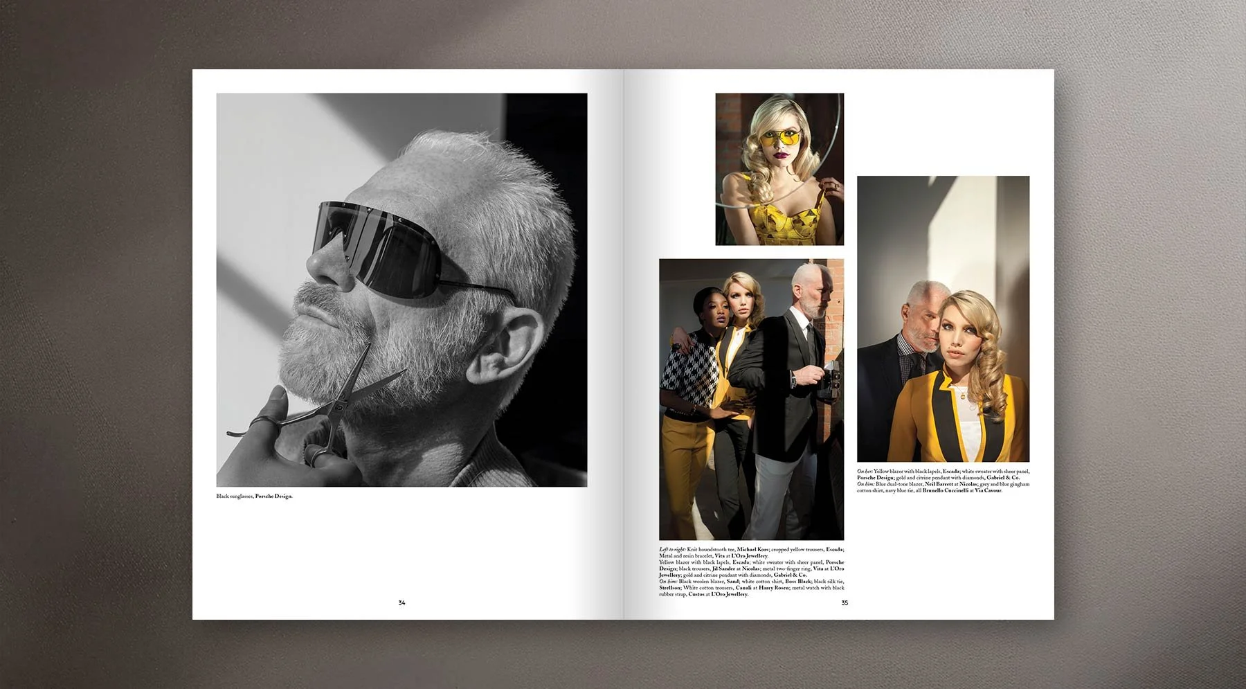
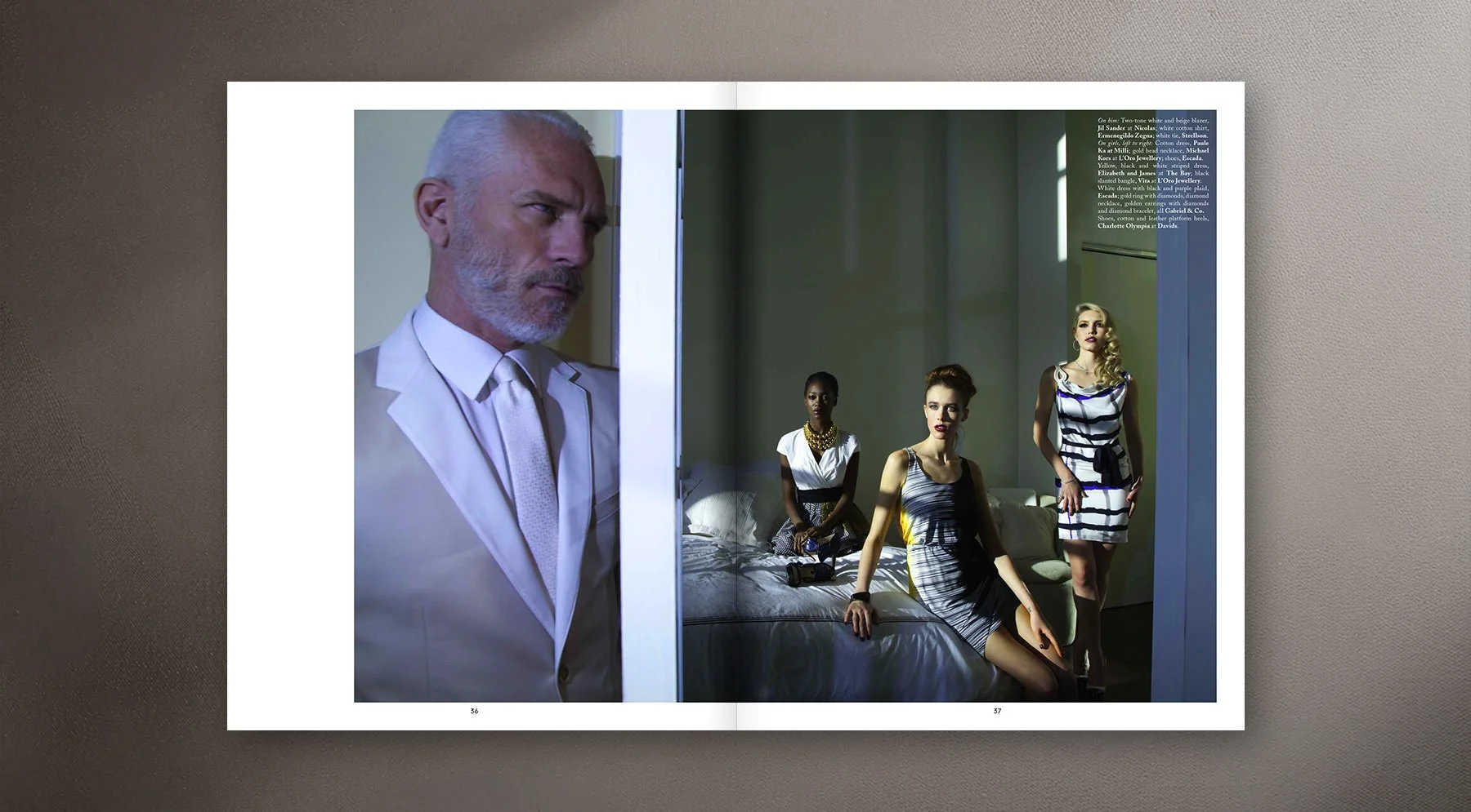
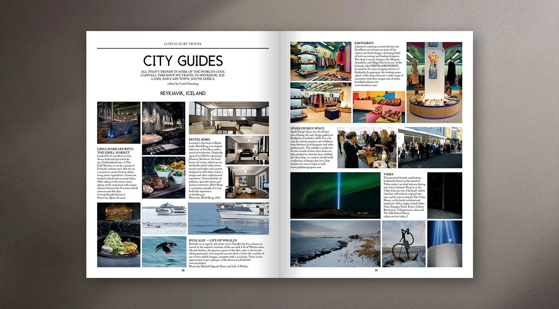
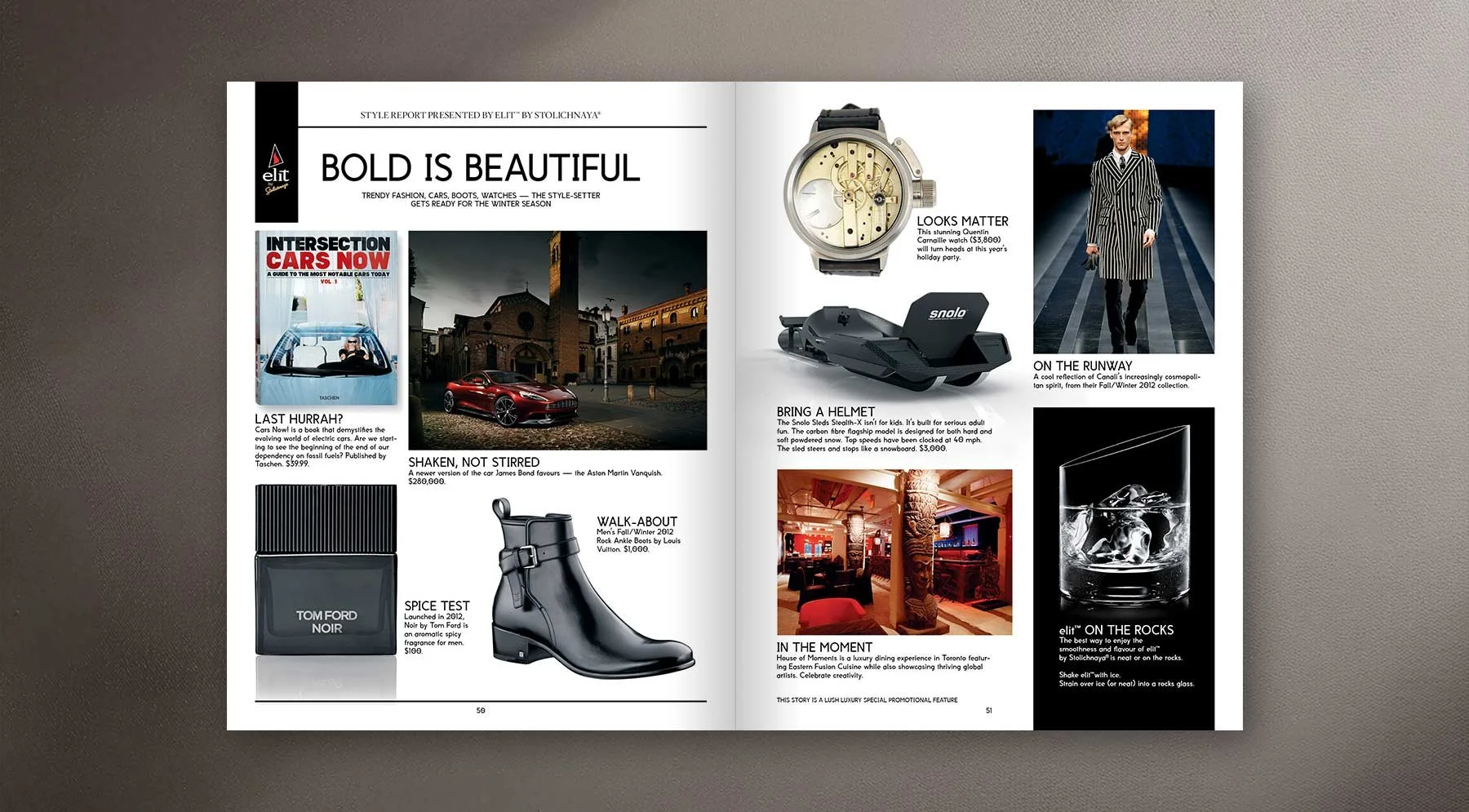
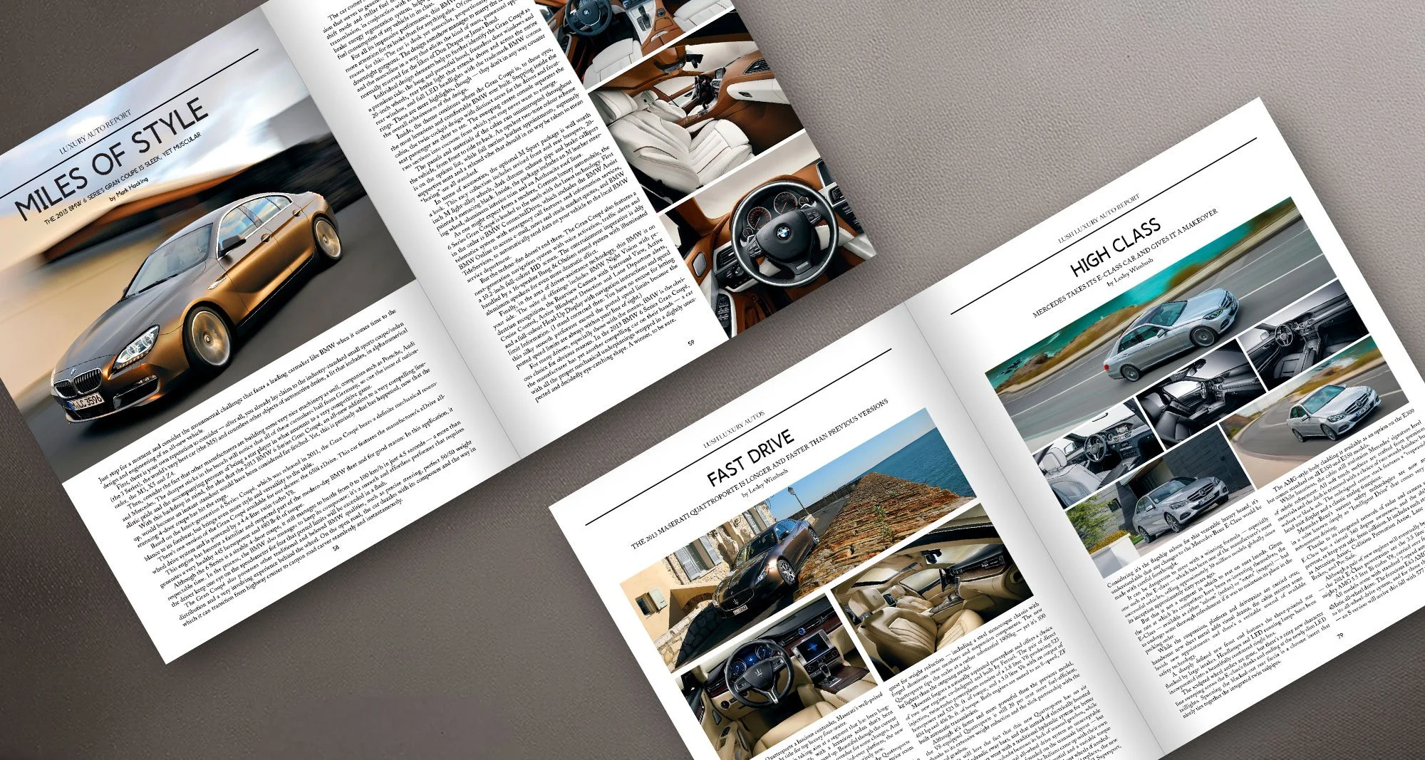
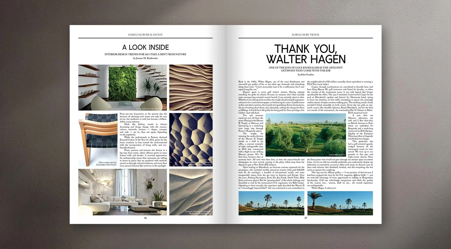
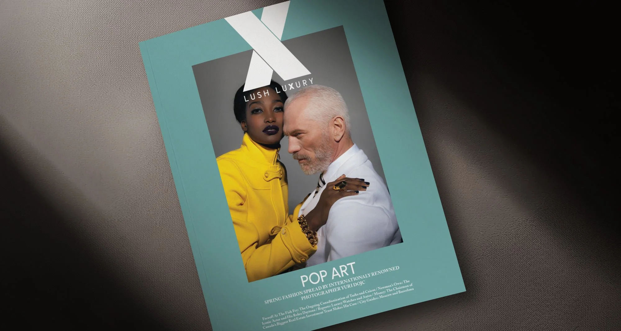
As Lead Designer, I led the editorial redesign of Lush Luxury Magazine to elevate its visual identity while supporting a broad range of fashion, travel, and cultural content. I introduced a cohesive typographic system and more disciplined grid structures to replace previously inconsistent layouts, while maintaining flexibility across diverse editorial formats.
The redesigned publication delivered a polished, high-end reading experience, improved readability, and established a repeatable framework that streamlined production and ensured consistency across future issues.
Client: Tommy Everett, Mark Keast
Team: Art Director, Writers, Editors
Skills: Editorial Design, Typography, Layout Design, Print Production
Tools: Adobe InDesign, Photoshop